 My Melodrama
 Catch while you still can
The Ruffled Universe of Costumier Hannah Oellinger
Getting a peak into opera costumier Hannah Oellinger’s mind is a wondrous thing. In this conversation with Melodrama she shares how her imagination is fed by movie costumes (she shouts-out Eiko Ishioka), museum catalogues, fairy tales, Elsa Schiaparelli’s enduring wit, the Met’s Camp exhibition and Walt Disney’s dialogue with French baroque to name but a few. What emerges out the other end is uniquely and joyously Hannah: “Ridiculously huge sleeves, billowing skirts, crinolines made from pool floats, hairy tails, hairy legs, and of course, ruffles. Ruffles I probably love the most.” In brief, her designs are transportive.
Colour is also discussed: “It’s political,” she insists in disbelief that the Pantone color of the year is white: “I think it is sending the worst message imaginable!” Colour signals plurality, freedom, and disobedience for Hannah, in a world too often ruled by beige. She also mentions how her pet peeve is the conversation surrounding historical accuracy in costume design (referencing Margot Robbie’s “Wuthering Heights” and Bridgerton) which she believes to be an incredibly limiting view which: “Implies that there ever was such a thing as a historical accurate costume, which there almost never was!”
 london

Louise Snouck Hurgronje: Hannah, your mind must be a wonderful place to live. Your designs are utterly fantastical and joyful in ways that you don’t often see. Would you say that you live in something of a fantasy land when creating your costumes?
Hannah Oellinger: In all honesty, I do think I have the best job in the world and I also think there is something quite magical about a costume coming to life, but maybe in a somewhat different way than you would imagine.
It is probably quite unknown how many people it takes, whose hard work, dedication and crafts(wo)menship make a costume. Although I am kind of a control freak, I also just love how every pair of hands decide the fate and direction of a costume. There is the director and the team (my partner and stage designer Manfred Rainer, who I usually work with), there are the heads of the costume department who oversee the management of the workshop, the budget, the sourcing of fabric, there are the cutters who interpret your sketches, the seamstresses who sew, the assistants, the shoemaker or milliner (if you are lucky), the hair and make up department who complete the look, the dressers who tend to the costumes and dress the performers, and then finally the performers who you need to be on board with your ideas. And every step of the way, everybody alters the path a little, or sometimes a lot. And I find that an incredibly enjoyable and exciting process. You can never be 100% sure of the outcome. I indeed have a lot of fun working.
When it comes to the designs themselves, I tend to always go where I find the most joy. I love ridiculously huge sleeves, billowing skirts, crinolines made from pool floats, hairy tails, hairy legs and of course ruffles. Ruffles I probably love the most. Come to think of it, this all sounds very much like a fantasy fairy tale sort of situation.
LSH: Talk to me about the utterly fabulous twenty-two Papatacci costumes you just created for the opera L’italiana in Algeri, what are they made of? What was your inspiration?

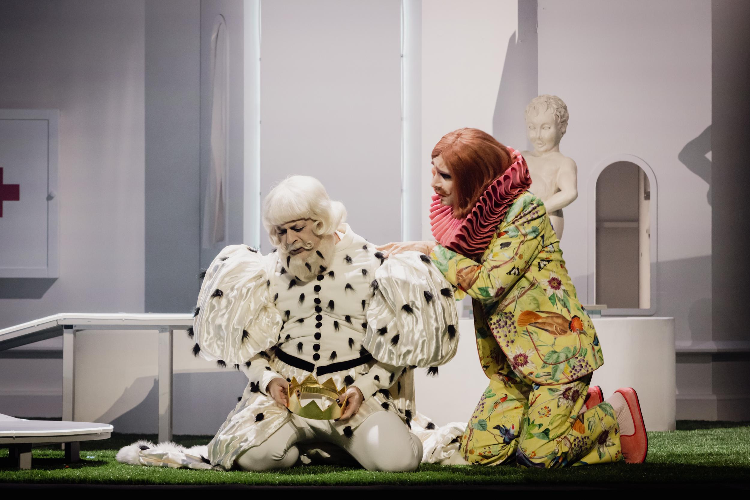
HO: The Papatacci are all about gluttony. Mustafa, the authoritarian slave holder, is tricked into being head of the Papatacci, an invented title that he can identify with because it involves eating and sleeping a lot. I wanted to interpret a gluttonous body in a more abstract manner, I didn’t want proper fat suits as there has been debate about whether that is stigmatizing. So I aimed at a more abstract interpretation. I wanted to have a colorful, vivid, queer crowd of different body types, an antidote to the authoritarian regime depicted and subsequently dethroned. And there are, again, a lot of ruffles, all made from tulle, in different layers. There are ruffle jackets, ruffle pants, tutus, and one whole ruffle jump suit. When I presented this idea to the workshop, I kept saying: I know this is a lot of work I am proposing, I understand if you say that this is impossible to ask of you. Months of work for the whole workshop and the costumes are only on stage for about 10 minutes! But they really liked the idea and so we did it.
LSH: I think I might have audibly gasped when I saw your Elsa Schiaparelli-inspired gown for The Fairy Queen. What connected Oberon with Schiaparelli for you? And what about Titania’s glittering gown, are those sequins or beads? Ok sorry, too many questions at once…!

HO: No connection! I just wanted gigantic sleeves for exaggerated movements and remembered seeing similar ones. Elsa Schiaparelli is someone who’s humor and take on fashion I very much admire and I love to go back to her for inspiration. The ornaments on Oberon‘s dress, made with distressed cotton fabric on mesh, are very organic, like tree branches. I love that the dress is a little transparent, making Oberon more vulnerable. Titania‘s gown, on the other hand, is really a nod to Max Reinhardt‘s film adaptation from 1935. The glittery, fringy frock from the movie I reinterpreted as a wig, our dress is made from metallic faux leather and a matching silver sequined fabric. To me it looks like snake scales and simultaneously like an armor. She very much has the upper hand in this power play.
We worked with a company in Milano in order to produce the costumes and I loved finding out that the people from the workshop also tried the costumes on and took pictures with them. I can’t tell you how happy this makes me! It is such a childlike sensation if you see a funny or beautiful costume and you just can’t resist the urge to put it on. I once joked around on Instagram that this is the best validation of my work and my favorite genre of photography and got a lot of pictures back from the people working on various of my costumes.

LSH: Are you often inspired by fashion designers? I see so many references from all over the world and across centuries in your work. How about the moth costume inspired by Eiko Ishioka for example?
HO: I love to look to fashion designers, old and new, I love love love movie costumes, yes Eiko Ishioka is an example. I also love museum catalogues, some of my favorites are the catalogues from Camp: Notes on Fashion exhibition at The Met, an exhibition about Walt Disney’s design relationship to French Baroque (Inspiring Walt Disney), and the Schiaparelli exhibition catalogue (The Surreal World of Elsa Schiaparelli). I really want to go to the Marie Antoinette exhibition at the V&A that is on until March, but unfortunately it has been sold out for months.

I also love 60s and 70s movies interpretations of historic costumes (such as Three Wishes for Cinderella), because it is easier to realize more of the lens we‘re seeing the costumes through—having a princess with heavy eyeliner and bangs and graphic printed fabric… That’s kind of my pet peeve atm, the discussion about historical accuracy in costume design. People are criticizing shows such as Bridgerton or movies like “Wuthering Heights” for not having periodically accurate costuming, fabrics that are too modern, wrong undergarments etc. I think this is such a limiting view and furthermore it implies that there ever was such a thing as a historical accurate costume, which there almost never was!
The costume of the moth I’m critical of today, I think it’s too much of a copy, I basically only changed the colors. Nowadays there is so much bold copying because we all tend to rely too heavily on Pinterest. It gets a little boring if all costume designers use the same five pictures as a reference, so I sometimes need to remind myself to also consult different sources.
LSH: Can we have a moment for your pink reaper though? I’d say it’s a pretty unlikely choice to put a reaper in pink tulle!?

HO: The pink reaper grew from a conversation with my director who wanted to have an embodiment of death that was also beautiful and comforting. I thought about the way that in Mexico Día de los Muertos is celebrated as an explosion of color and how death seems a little less scary. It ended up being very touching the way that the lifeless, sick and grey Mimi is dancing with this vibrant death, foreshadowing her destiny in the play.
LSH: Truly. Your costumes are usually infused with bright color, I assume that a director asks you to join a project knowing and wanting to add this to their production?
HO: Generally color is such an interesting topic when it comes to its use in opera. There has been a lot of black and grey costuming in the last 10 years, a lot of people are yearning for fun and color! But color for me is also political. It can signalize plurality, freedom of expression. Isn’t it funny that the Pantone color this year is white? I think it is sending the worst message imaginable!
In our version of Italiana, Mustafa is the powerful boss of a hotel who has his staff all dressed in one color; beige, signifying his authoritarian regime. Their disobedience is voiced by reintroducing color by the likes of the rebellious Isabella, dressed in bright jewel tones.
LSH: If you had to distill it to one thing, what would you say that you love most about working in the opera?
HO: Well I still have no clue about music, I can‘t play any instrument! I also do not come from a family where going to the opera was a thing. Sometimes I think not being able to play myself, makes music even more magical for me. And music is such a powerful tool for evoking emotions. The production I am currently working on, The Fairy Queen which is a rendition of Shakespeare’s A Midsummer Night’s Dream, has the most insane music, it’s just so beautiful. When our counter tenor, Theo Imart, is singing it always sends chills down my spine. Then I think: am I not the most lucky person to get to work in such a fabulous setting?
LSH: I certainly envy your office. Ok and lastly, favourite costume you’ve ever made?
HO: Probably still the crinoline of the three ladies in The Magic Flute. I had placed all three of them in one crinoline baroque court dress. It was verrry restrictive, they really needed to coordinate their every move and my director was maybe not always happy about that. But hey, the dress made the scene! In fact, I might bring this idea back to one of my next productions…

When it comes to the entirety of a costume design, I have two favorites: The Love for Three Oranges (2022, Dir: Anna Bernreitner) which we produced in the Opéra national de Nancy-Lorraine and the latest L’italiana in Algeri (2026, Dir: Julien Chavaz) in the Grand Théâtre de Genève. The first had the most intricate details, hand stitched embroidery, hand-sewed ruffle collars, crinoline pants and very much fairy tale costumes. The second one, though equally historically inaccurate, leans more towards the contemporary and 70s/80s fashion which is something different and a new direction for me as I tend to mostly do historical references and silhouettes. I ended up being really proud of the costume dramaturgy and the color rhythm. The play starts very beige, sandy, a nod to Algiers, and the color just slowly seeps in like the disobedience amongst the slaves, first a pair of yellow rubber gloves, then an apricot collar, until we get the all colorful Papatacci in the finale.

Leave A ResponseWe’d love to hear your thoughts on this show!
You must be logged in to post a comment.